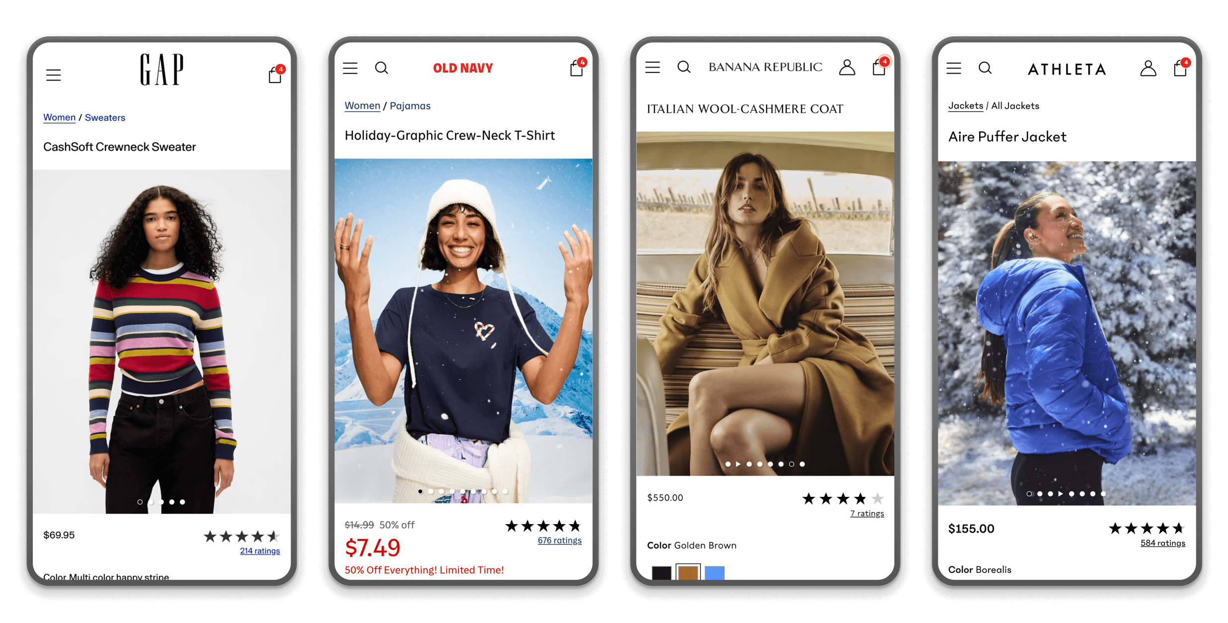
Overview
Challenge
Discovery
Solution
Insight
Unifying Four Brands Under One Design System.

Helping Gap Inc. deliver a cohesive cross-brand shopping experience through a scalable, unified design system.

Our team built together the foundational design system for Gap Inc.’s multi-branded e-commerce platform, enabling consistent experiences across four distinct brands — Gap, Old Navy, Banana Republic, and Athleta.

Impact

  • Unified design language and component library
  • Streamlined design-to-development handoff, improving delivery speed
  • Reduced duplicated design assets and inconsistencies

Case

The Challenge

Managing multiple brand identities within one shared platform created fragmented user experiences and inefficient workflows. Each brand had its own UI patterns, tone, and audience expectations, resulting in disjointed interactions and inconsistent usability.

Key pain points

  • Inconsistent UX: Unique brand styles led to divergent interfaces and interactions.
  • Inefficient Design Asset Management: Multiple libraries and guidelines created redundancy and slowed production.
  • Navigation & Information Architecture: Meeting the needs of diverse users while maintaining clarity across brands was difficult.
  • Scalability & Flexibility: The system needed to evolve with future features and brand directions without losing cohesion.
Analytics and design reviews showed recurring usability gaps across the four brand sites, confirming the need for a unified yet flexible foundation.

My Role

  • Customer Research
  • UI Design
  • Prototyping
  • Stakeholder Alignment

Design Audit

What the Audit Revealed

The audit uncovered extensive redundancy across the ecosystem — over 200 components performing identical functions, inconsistent interaction patterns, divergent visual and token systems, and accessibility gaps that varied by brand. These inconsistencies created user friction, slowed design and development, and made cross-brand scalability difficult. The findings provided clear evidence that a unified, token-driven system was essential for improving quality and efficiency across all four brands.

How the Audit Provided Value

The audit delivered a clear blueprint for unifying the brands: it exposed consolidation opportunities, aligned stakeholders around a shared design language, and established the foundation for a scalable design system. By quantifying redundancies and documenting gaps, the audit justified investment, accelerated decision-making, and enabled a 40% faster design-to-development handoff and a 60% reduction in redundant components. It became the strategic anchor that guided every component, token, and accessibility decision moving forward.

No items found.

Research

Baymard Research

The audit delivered a clear blueprint for unifying the brands: it exposed consolidation opportunities, aligned stakeholders around a shared design language, and established the foundation for a scalable design system.

User Interviews

The audit delivered a clear blueprint for unifying the brands: it exposed consolidation opportunities, aligned stakeholders around a shared design language, and established the foundation for a scalable design system.

A/B Testing
The audit delivered a clear blueprint for unifying the brands: it exposed consolidation opportunities, aligned stakeholders around a shared design language, and established the foundation for a scalable design system.

No items found.
No items found.

Component Build

Ensuring that the design system can scale as new features or products are introduced while maintaining flexibility to adapt to evolving market trends and user preferences.

No items found.

A/B Testing for Iterative Design

Ensuring that the design system can scale as new features or products are introduced while maintaining flexibility to adapt to evolving market trends and user preferences.

No items found.

Solution

  • The final design system provided a cohesive platform foundation with the flexibility to express each brand’s personality.Core outcomes:
    • Unified Component Library: Buttons, swatches, modals, and PDP modules standardized across brands.
    • Design Tokens: Centralized values for color, typography, spacing, and states to enable scalable brand theming.
    • Accessibility First: All components met WCAG 2.1 AA standards for contrast and interaction.
    • Documentation & Guidelines: Clear usage guidance ensured design consistency and developer alignment\

Visual suggestion: Grid or carousel showing the same components styled for each brand (e.g., Add-to-Bag buttons or PDP image galleries across Gap, Old Navy, Banana Republic, Athleta).

No items found.
No items found.

No items found.
No items found.

No items found.
No items found.

No items found.

No items found.

No items found.

Outcomes

The unified design system reduced design and development inefficiencies while enhancing cross-brand cohesion.

Measured outcomes:

  • 40% faster design-to-development handoff
  • 60% reduction in redundant Figma components
  • Improved visual and interaction consistency across all four brand sites
  • Increased designer adoption and alignment within 3 months of rollout
“The system empowered brand teams to move faster, stay consistent, and focus on user experience instead of re-creating UI elements.”

Next Steps

The foundation now serves as the backbone for all new Gap Inc. digital experiences.

Planned evolution:

  • Extend the system to native app platforms
  • Integrate advanced design tokens for theming and personalization
  • Build an internal governance dashboard for version tracking and adoption metrics
“Next, we aim to scale beyond consistency — towards intelligent, adaptive design systems that respond to user context and brand storytelling.”